Customize Layout, Branding and Colors
Match the widget to your client's brand: style, logo, icon, position, size, corners, theme, colours, title, call-to-action button and footer, checked in Live Preview.
Written By voiceaiwrapper
Last updated 26 days ago
Your widget should look like it belongs on your client's business website, not like a third-party add-on. This article walks through every look-and-feel setting in the widget builder: style, logo, icon, position, size, corners, theme, colours, title, call-to-action button and footer.
Each change shows up straight away in Live Preview, so you can try things before saving.
Before you start
- A widget to edit. Open it from the agent's Deploy → Widget sub-tab (VAW Native), or from a campaign's Web Widget tab. See Add a Widget to a VAW Native Agent or Create an Inbound Widget Campaign.
- Your client's logo, as a square image under 2 MB, and their brand colours as hex codes (for example
#1a73e8).
How the builder is laid out
The builder has three tabs above the form, with the Live Preview panel next to it (below it on smaller screens):
- Configuration: interaction mode, agents, style, branding, layout, theme and colours. Most of this article.
- Content: the title, subtitle, button text and footer.
- Settings: behaviour, limits and consent. See Voice and Chat Settings.
Some sections only appear when they apply. For example, chat colours appear only when chat is turned on, and the call-to-action settings only for the Card style.
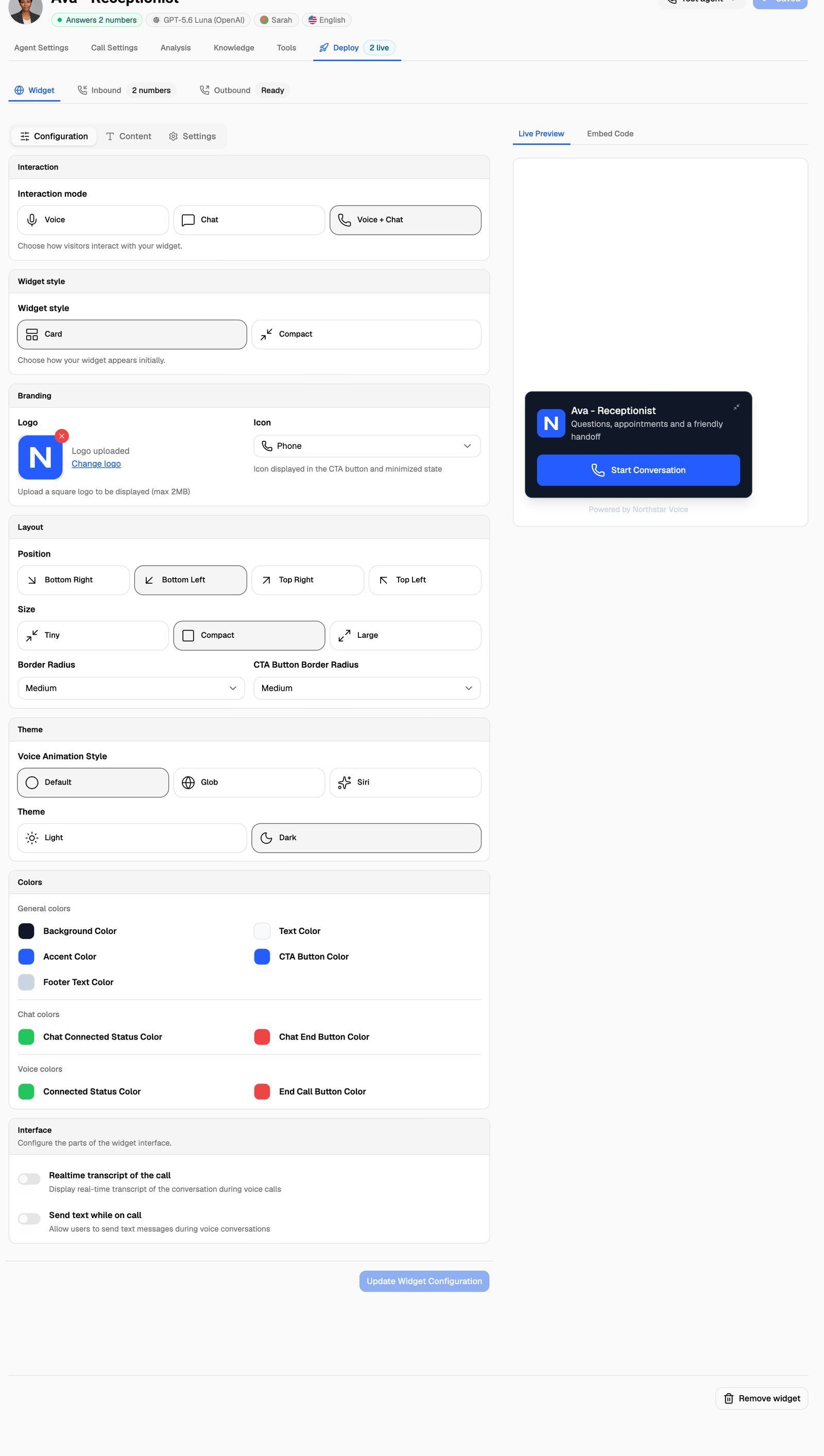
Widget style
Under Widget style, choose how the widget looks before a visitor opens it:
Branding
Layout
Theme
Pick Light (default) or Dark.
Changing the theme resets four colours: Background Color, Text Color, Accent Color and CTA Button Color. Light sets a white background with black text, accent and button. Dark sets the opposite. Choose the theme first, then set your brand colours.
The Theme section also holds Voice Animation Style when voice is on. See Voice and Chat Settings.
Colors
Click a colour swatch to pick a colour or type a hex code.
Text on the call-to-action button switches between dark and light automatically to stay readable on the CTA Button Color you pick.
Title, subtitle, button and footer
These are on the Content tab.
The Content tab also holds the button text and messages for voice and chat. See Voice and Chat Settings.
Check and save
- Look at the widget in Live Preview. Open it and start a conversation to see the open state in your colours. Preview conversations are real, so they use AI credits on VAW Native.
- Click Update Widget Configuration. You'll see Widget updated successfully.
Saved changes reach every site that uses the widget's embed code. You don't need to paste the code again.
Frequently asked questions
The Update Widget Configuration button is greyed out.
The Update Widget Configuration button is greyed out.
It only turns on when you've changed something since the last save. If you've made changes and it's still greyed out, you may only have view access to this widget (for example in the client portal).
My colours changed back after I switched the theme.
My colours changed back after I switched the theme.
Switching between Light and Dark resets the background, text, accent and button colours. Set your brand colours again after choosing the theme, then save.
Can I remove all VoiceAIWrapper branding?
Can I remove all VoiceAIWrapper branding?
The widget shows only what you set: your logo, title, subtitle, button text and footer. To serve the widget's code from your own domain as well, connect a custom domain for your client portal. See Connect Your Custom Domain and Embed the Widget on a Website.
Related articles
Was this helpful?
Still need help? Share an idea